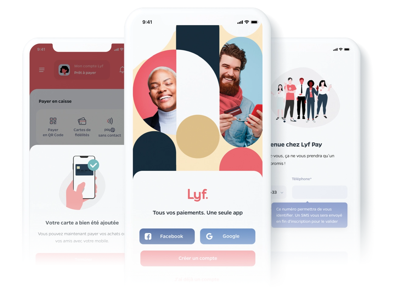
A new sign up experience for the Lyf Pay app
Lyf Pay is a payment app regrouping various payment experiences from retail ones like store payments, click & collect, scan & pay, to peer to peer ones like paying a friend, creating money pots and more.
Research / UX / UI / mobile
The challenge
User onboarding experience is the most critical part of the app because it reflects on the first impression of the app. A great impression of this workflow can change the balance and optimise the user acquisition. Our first version of it had failed in the usability test. The onboarding experience as it was, created several pain points that caused frustration and users dropped off on their way of creating an account. Our goal was to identify key insights and create a new workflow that will be clearer and frictionless.
Identifing user drop off points
Research & Insights
Through research in collaboration with our data scientist, and after several interviews with users we identified that the current workflow process makes it difficult for users to understand what they need to do.It was hard for us to gain their trust along the current experience.
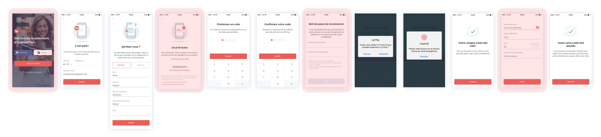
The first pain point was the first impression of the current screen after the app download. The visual used was not modern and the information was all over the place. We realised people wanted to stop there during the interviews because using the app wasn’t clear for them.
The numerous fields and steps gave the impression that the sign up was endless and demanded a lot of personal information that users were afraid to give.
The device binding system was a very particular one and old fashioned. At this particular step we were losing 50% of our users. This was a big problem we needed to solve because it involved app’s security, and for a payment app it is the main value.
Adding a credit card was a big issue for users. Since the onboarding experience wasn't clear, they didn't feel secure enough to add their card and didn’t understand its utility.
The overall UI wasn’t up to date with the app, which was in a redesign stage.
Identifing user drop off points
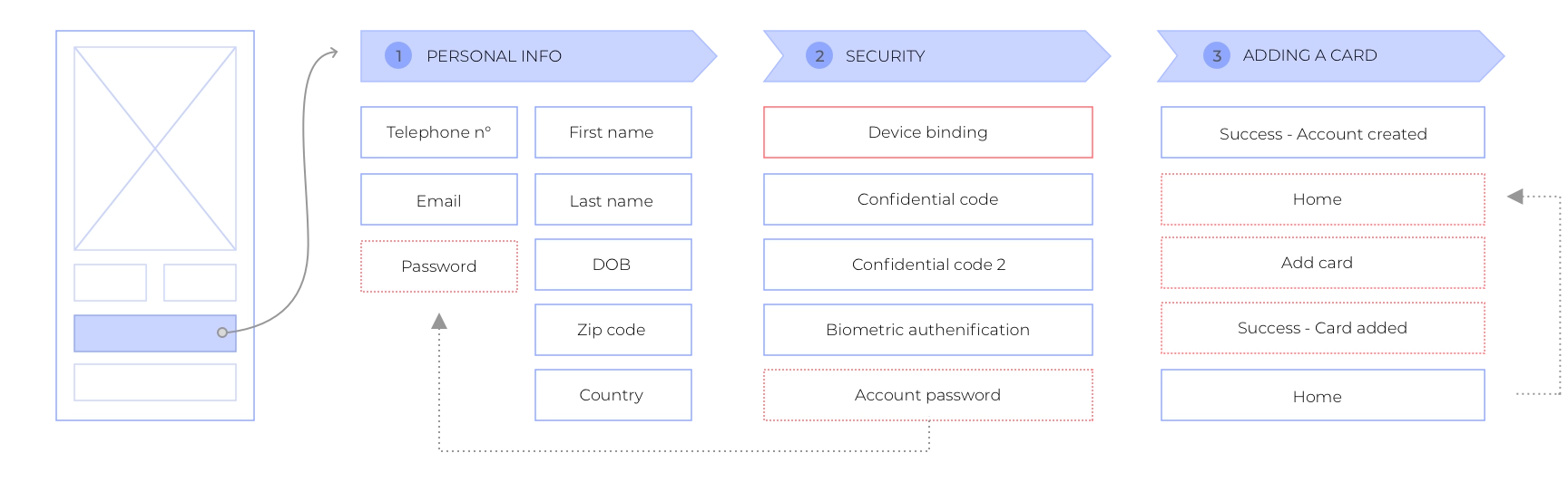
Test, Iterate, & repeat
We worked on mapping the global workflow, placing one step after the other, merging steps, separating steps and testing after every change. I designed variations of prototypes I shared with my team to have their feedback including the engineering team. After regrouping the inputs I went back to the drawing board for another iteration of the designs. Every step of the workflow was reviewed, and I felt like all the important pieces came together.
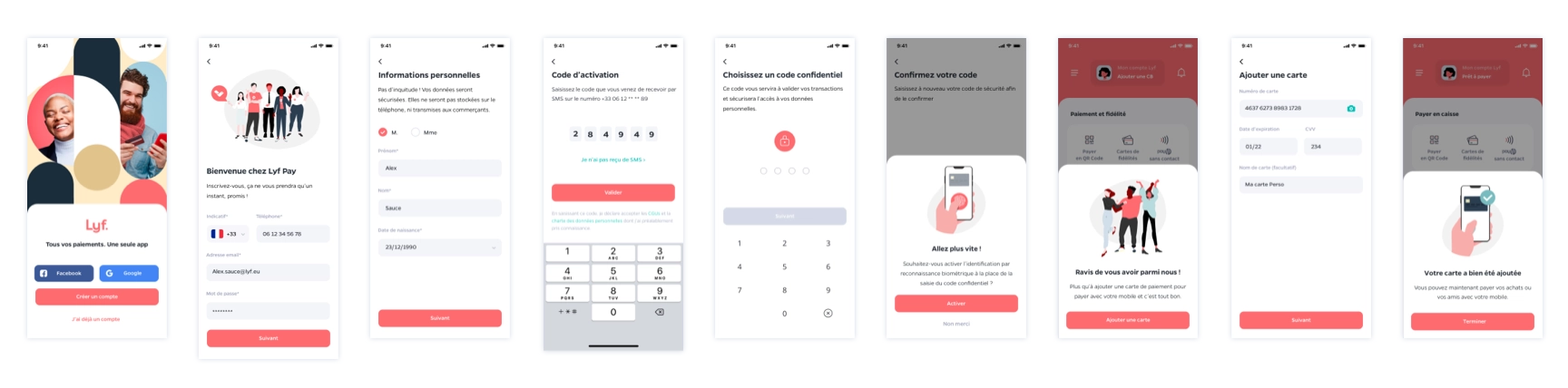
The validated protypes
Results & Learnings
The new sign up experience brought a slick experience to a complex, often painful, workflow that users need to complete to create an account. Our goal was to minimize the information in every step and make it less overwhelming as the user goes forward on the workflow. Also, the design was updated to the rest of the app to be more modern and fresh
This first impression in this workflow is essential to gain users’ trust at the beginning of their app’s journey. With the right design we can hopefully do so.
This project is ongoing and will be in production at the end of the year.