Redesigning information architecture for the Lyf Pay app
Lyf Pay is a payment app regrouping various payment experiences from retail ones like store payments, click & collect, scan & pay, to peer to peer ones like paying a friend, creating money pots and more.
Research / UX / UI / mobile
The challenge
The Lyf Pay app is growing fast constant business opportunities, while features are added every quarter. The presentation of features was confusing for users, especially the information architecture. The display of functionalities in a vertical list did not offer an optimal presentation. In addition, the architecture was not suitable for adding new features. This problem raised a big warning flag for us. And finally, our interface was outdated compared to that of our competitors.
The design process
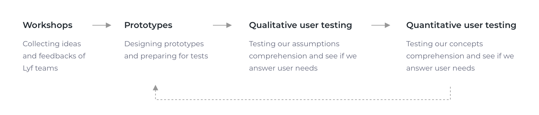
Conception & workshops
In collaboration with a UX researcher we put together several workshops with all company teams starting with management through sales, marketing and engineering. We used the “6-to-1 methodology” to regroup all ideas we can get on the conception of the home screen.
Insights
We synthesised the prototypes done, and searched for the patterns that were used the most. The numerous feedbacks allowed us to gather expectations regarding the new Home, such as:
- A need to categorize the different functionalities. This was our number one priority.
- A desire to have a new information architecture, with two recurring structures among the proposals: a deep architecture via menus or a more "flattened" layout with a simplified display of functionalities.
- A need for better naming to designate features, with more contextual words. For example, naming a feature "Pay in store" instead of something more abstract like "Pay with Lyf".
- A desire for new features, such as a contextual quick action button, which would change depending on the geolocation of users.
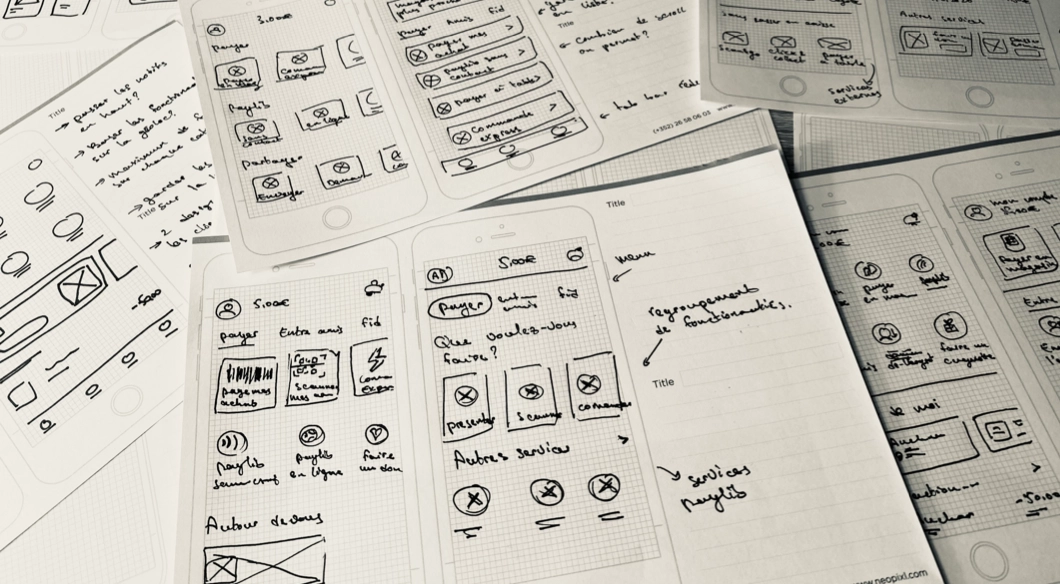
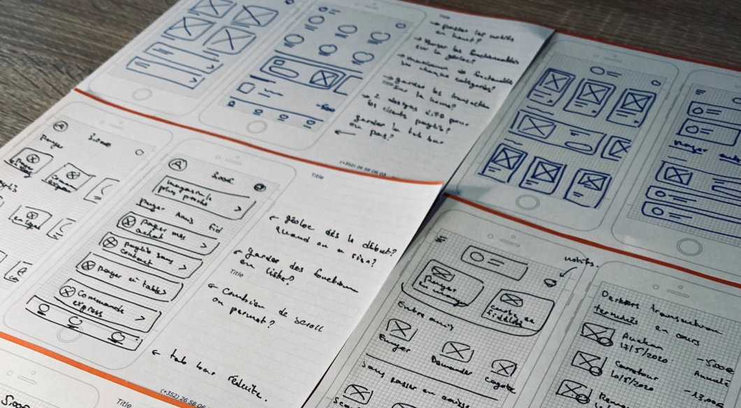
Early prototypes from low fidelity to higher ones
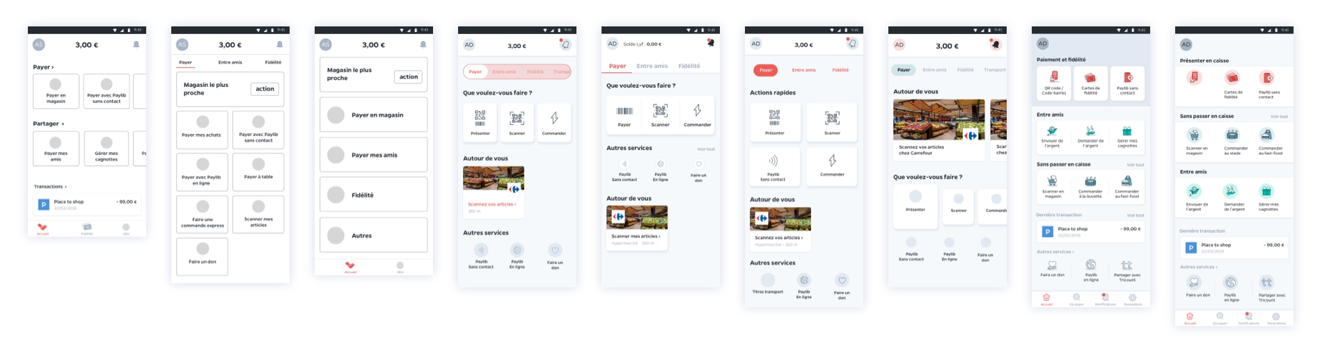
Test, Iterate, & repeat
From these workshops and insights, we produced several prototypes. These prototypes were the starting points for our user tests. We carried out qualitative user tests of the prototypes we've done on over 30 participants, half knew the app before and the other half didn’t at all. This allowed us to evaluate users' expectations and understanding of our new home screen, and their preferences regarding clarity and ease of navigation. The tests lasted a little over 2 months.
As the tests progressed, we refined the prototypes more and more. The objective of the tests has also shifted from evaluating the clarity of the interface, by presenting static screens, to a more global evaluation of user journeys within the application, with more complete prototypes. As the project progressed, we added quantitative tests, involving more testers with over 100 non-Lyf Pay users.
After all the tests, we validated several hypotheses on the hierarchy of elements and proposed a final architecture of the home screen with more confidence in the decisions made. The users completed our main routes without significant problems and understood most of the screens we showed them. Overall, the process was very successful and resulted in the version of the application available.
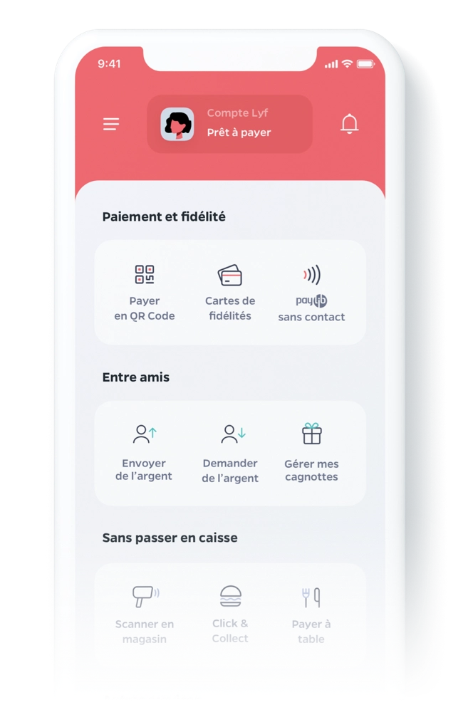
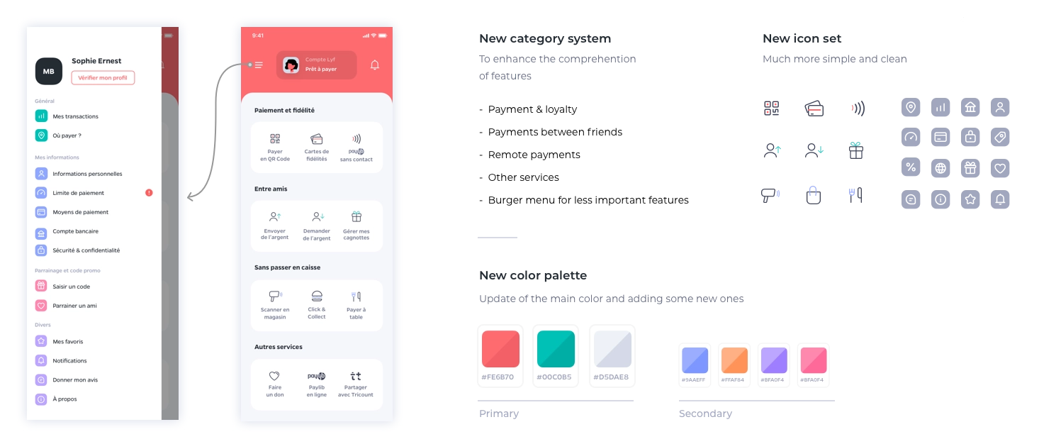
The validated designs
Results & Learnings
I was delighted to have been able to be part of this project, which clearly would not have been possible without the help and coordination with other teams. Starting from an initial problem of information architecture, we have succeeded as a group in proposing a new navigation experience that works better, is clearer and simpler.
The effects of this were felt quickly and were easy to measure, with a + 40% increase in our send money functionality and a 90% satisfaction rate according to a questionnaire sent to 1000+ users.